Category Archives: Infragistics

I want row automation id’s on my XamDataGrid…

As part of work I’m doing at the moment, building a UI automation API for our testers. I continually come across issues around data grid controls and access the rows within it (we’re primarily using XamDataGrids from Infragistics).

What I need is to have an AutomationId reflecting some form of index in the grid. Good news is we can do this…

If we take a XamaDataGrid and create a style such as this

<Style x:Key="RowPresenterStyle" TargetType="igDP:DataRecordPresenter">
  <Setter Property="AutomationProperties.AutomationId" Value="{Binding DataItemIndex}" />
</Style>

and now in the XamDataGrid’s FieldLayoutSettings we can apply this style using

<igDP:XamaDataGrid.FieldLayoutSettings>
  <igDP:FieldLayoutSettings
     <!-- Other settings -->
     DataRecordPresenterStyle="{StaticResource RowPresenterStyle}" />
</igDP:XamaDataGrid.FieldLayoutSettings>

A few tips and tricks for using Infragistics XamDataGrid

Note: This post was written a while back but sat in draft. I’ve published this now, but I’m not sure it’s relevant to the latest versions etc. so please bear this in mind.

I’m working on a project using the XamDataGrid. I’ve used the UltraWinGrid by Infragistics in the past but that doesn’t help at all when moving code from Windows Formds to WPF. So here’s a list of a few commonly required features and how to do them using the XamDataGrid.

Note: this post only refers to using version 12.2

Grid lines

Problem: By default there are no grid lines on the XamDataGrid.

Solution: In your ResourceDictionary (within Generic.xaml or wherever you prefer) add the following

<Style TargetType="{x:Type igDP:CellValuePresenter}">
   <Setter Property="BorderThickness" Value="0,0,1,1" />
   <Setter Property="BorderBrush" Value="{x:Static SystemColors.ControlLightBrush}" />
</Style>

Obviously replace the BorderBrush colour with your preferred colour.

Remove the group by area

Problem: I want to remove the group by section from the XamDataGrid.

Solution: In your ResourceDictionary (within Generic.xaml or wherever you prefer) add the following

<Style x:Key="IceGrid" TargetType="igDP:XamDataGrid">
   <Setter Property="GroupByAreaLocation" Value="None" />
</Style>

don’t forget to apply the style to your grid, i.e.

<dp:XamDataGrid Style="{StaticResource IceGrid}" DataSource="{Binding Details}">
   <!- Your grid code -->
</dp:XamDataGrid>

Column formatting

Problem: We want to change the numerical formatting for a column

Solution: We can set the EditorStyle for a field (editor doesn’t mean it will make the field editable)

<dp:XamDataGrid.FieldLayouts>
   <dp:FieldLayout>
      <dp:FieldLayout.Fields>
         <dp:Field Name="fee" Label="Fee" Width="80">
            <dp:Field.Settings>
               <dp:FieldSettings>
                  <dp:FieldSettings.EditorStyle>
                     <Style TargetType="{x:Type editors:XamNumericEditor}">
                        <Setter Property="Format" Value="0.####" />
                     </Style>
                  </dp:FieldSettings.EditorStyle>
               </dp:FieldSettings>
           </dp:Field.Settings>
        </dp:Field>         
      </dp:FieldLayout.Fields>
   </dp:FieldLayout>
</dp:XamDataGrid.FieldLayouts>

This code creates a field named fee and with the label Fee and the editor is set to only display decimal places if they actually exist.

As we’re defining the fields you’ll need to turn off auto generation of fields, as per

<dp:XamDataGrid.FieldLayoutSettings>
   <dp:FieldLayoutSettings AutoGenerateFields="False" />
</dp:XamDataGrid.FieldLayoutSettings>

XamDataGrid tips and tricks

Note: This post was written a while back but sat in draft. I’ve published this now, but I’m not sure it’s relevant to the latest versions etc. so please bear this in mind.

The following is a general list of tips and tricks for working with the XamDataGrid. Primarily code/xaml which doesn’t require a full post of their own.

Enable/disable column sorting or change the way the sorting is applied

Simply set the LabelClickAction on the FieldSettings to “Nothing” to turn sorting off. You can also change the logic for sort in that you can set the sorting to single or multi field.

<igDP:XamDataGrid>
   <igDP:XamDataGrid.FieldSettings>
      <igDP:FieldSettings LabelClickAction="Nothing" />
   </igDP:XamDataGrid.FieldSettings>
</igDP:XamDataGrid>

Changing cell styles and more in code-behind

Sometimes our requirement is too dynamic for the declarative nature of XAML and/or may be difficult to handle via styles/triggers and converters so we need to write some code. The problem is getting at the cell object at the right time.

This is where the CellsInViewChanged event is useful, for example

private void CellsInViewChanged(object sender, CellsInViewChangedEventArgs e)
{
   foreach(var visibleDataBlock in e.CurrentCellsInView)
   {
      foreach(var record in visibleDataBlock.Records)
      {
         foreach(var field in visibleDataBlock.Fields)
         {
            var cellValuePresenter = CellValuePresenter.FromRecordAndField(record, field);
            // do something with the cell value presenter
         }
      }
   }
}

In the above code (which we seem to have to attach an event handler to, i.e. there’s no virtual method for deriving our own implementation from that I can see). We get a list of VisibleDataBlock items which we loop through to get the records and the fields. Using the CellValuePresenter.FromRecordAndField we can then get the CellValuePresenter where we can then change visual style directly, such as the cell background colour, we can make the cell’s editor readonly and so on.

How to stop a cell “appearing” to go into edit mode

We may set a cell’s editor to readonly but when the user clicks on the cell the cell changes colour as if switching to edit more and the caret is displayed, even though you cannot edit the field. A way to stop this happening is by overriding the OnEditModeStarting method in a subclassed grid control or intercepting the EditModeStarting event on the grid. For example

protected override void OnEditModeStarting(EditModeStartingEventArgs args)
{
   // required to stop the cell even entering edit mode
   var cvp = CellValuePresenter.FromCell(args.Cell);
   if (cvp != null)
   {
      args.Handled = args.Cancel = cvp.Editor.IsReadOnly;
   }
}

Same XamDataGrid different layouts for different types

In some cases you might be using Infragistic’s XamDataGrid with differing types. For example, maybe a couple of types have the same base class but each have differing properties that you need the grid to display or maybe you have heterogeneous data which you want to display in the same grid.

To do this we simply define different field layouts within the XamDataGrid and use the Key property to define which layout is used for which type.

Let’s look at a simple example which will display two totally different sets of columns for the data. Here’s the example classes

public class Train
{
   public string Route { get; set; }
   public int Carriages { get; set; }
}

public class Car
{
   public string Make { get; set; }
   public string Model { get; set; }
   public float EngineSize { get; set; }
}

as you can see, the classes do not share a common base class or implement a common interface. If we set up our XamDataGrid like this

<ig:XamDataGrid DataSource="{Binding}">
   <ig:XamDataGrid.FieldLayouts>
      <ig:FieldLayout Key="Train">
         <ig:Field Name="Route" />
         <ig:Field Name="Carriages" />
      </ig:FieldLayout>

      <ig:FieldLayout Key="Car">
         <ig:Field Name="Make" />
         <ig:Field Name="Model" />
         <ig:Field Name="EngineSize" />
      </ig:FieldLayout>
   </ig:XamDataGrid.FieldLayouts>
</ig:XamDataGrid>

we can then supply an IEnumerable (such as an ObservableCollection) with all the same type, i.e. Car or Train objects or a mixture of both.

The Key should have the name of the type which it’s field layout applies to. So for example, when Train objects are found in the DataSource, the Train FieldLayout is used hence the columns Route and Carriages will be displayed, likewise when Car objects are found the Car layout is used, thus Make, Model and EngineSize are displayed.

Note: The field layout is used for each row, i.e. the grid control doesn’t group all Trains together and/or all Cars, the rows are displayed in the order of the data and thus the field layouts are displayed each time the object type changes.

The column background colour in my XamDataGrid keeps changing

The column background colour in my XamDataGrid keeps changing or to put it another way, beware the CellContainerGenerationMode when overriding the CellValuePresenterStyle.

What’s the problem ?

First off, please note I’m using v12.2 of Infragistics XamDataGrid, ofcourse this functionality may work differently in other versions of the control.

I’m still getting to grips with the Infragistics XamDataGrid. Whilst I know the old UltraGrid for WinForms pretty well, this is worthless experience when using the WPF XamDataGrid.

I was working on a way to highlight a “Reference” field/column in the XamDataGrid and got this working nicely using a Converter with a CellValuePresenterStyle but whilst playing with the UI I notice that horizontally scrolling the grid demonstrated a very strange behaviour. Initially my reference column was displayed with a gray background (my chosen colour) but when I scroll it out of view and back into view, it turned white (the default background). Worse still another column went gray. Not the sort of functionality a customer/user would want to see !

Let’s take a look at an example.

Note: this is a contrived example to demonstrate the issue, the code I was working on was more dynamic and the fields set-up in code behind, but I wanted to distill the example into it’s simplest components.

In this sample code I’m using a DataTable and a CellValuePresenterStyle (obviously this problem may not occur in different scenarios).

First up, let’s look at the sample data, we’re going to create enough columns to require us to horizontally scroll

var dataTable = new DataTable();
dataTable.Columns.Add("A1", typeof(int));
dataTable.Columns.Add("B1", typeof(int));
dataTable.Columns.Add("C1", typeof(int));
dataTable.Columns.Add("D1", typeof(int));
dataTable.Columns.Add("E1", typeof(int));
dataTable.Columns.Add("F1", typeof(int));
dataTable.Columns.Add("G1", typeof(int));
dataTable.Columns.Add("H1", typeof(int));
dataTable.Columns.Add("I1", typeof(int));
dataTable.Columns.Add("J1", typeof(int));
dataTable.Columns.Add("K1", typeof(int));
dataTable.Columns.Add("L1", typeof(int));
dataTable.Columns.Add("M1", typeof(int));
dataTable.Columns.Add("N1", typeof(int));

var row1 = dataTable.NewRow();
row1["A1"] = 1;
row1["B1"] = 1;
row1["C1"] = 1;
row1["D1"] = 1;
row1["E1"] = 1;
row1["F1"] = 1;
row1["G1"] = 1;
row1["H1"] = 1;
row1["I1"] = 1;
row1["J1"] = 1;
row1["K1"] = 1;
row1["L1"] = 1;
row1["M1"] = 1;
row1["N1"] = 1;
dataTable.Rows.Add(row1);

var row2 = dataTable.NewRow();
row2["A1"] = 2;
row2["B1"] = 2;
row2["C1"] = 2;
row2["D1"] = 2;
row2["E1"] = 2;
row2["F1"] = 2;
row2["G1"] = 2;
row2["H1"] = 2;
row2["I1"] = 2;
row2["J1"] = 2;
row2["K1"] = 2;
row2["L1"] = 2;
row2["M1"] = 2;
row2["N1"] = 2;
dataTable.Rows.Add(row2);

DataContext = dataTable;

Next up, let’s look at the XAML for the XamDataGrid

<igDP:XamDataGrid DataSource="{Binding}" >
   <igDP:XamDataGrid.FieldLayouts>
      <igDP:FieldLayout>
         <igDP:FieldLayout.Fields>
            <igDP:Field Name="A1" Label="A1">
               <igDP:Field.Settings>
                  <igDP:FieldSettings CellValuePresenterStyle="{StaticResource CellValuePresenterStyle}"/>
               </igDP:Field.Settings>
            </igDP:Field>
            <igDP:Field Name="B1" Label="B1">
               <igDP:Field.Settings>
                  <igDP:FieldSettings CellValuePresenterStyle="{StaticResource CellValuePresenterStyle}"/>
               </igDP:Field.Settings>
            </igDP:Field>
            <igDP:Field Name="B1" Label="B1">
               <igDP:Field.Settings>
                  <igDP:FieldSettings CellValuePresenterStyle="{StaticResource CellValuePresenterStyle}"/>
               </igDP:Field.Settings>
            </igDP:Field>
            <igDP:Field Name="C1" Label="C1">
               <igDP:Field.Settings>
                  <igDP:FieldSettings CellValuePresenterStyle="{StaticResource CellValuePresenterStyle}"/>
               </igDP:Field.Settings>
            </igDP:Field>
            <igDP:Field Name="D1" Label="D1">
               <igDP:Field.Settings>
                  <igDP:FieldSettings CellValuePresenterStyle="{StaticResource CellValuePresenterStyle}"/>
               </igDP:Field.Settings>
            </igDP:Field>
            <igDP:Field Name="E1" Label="E1">
               <igDP:Field.Settings>
                  <igDP:FieldSettings CellValuePresenterStyle="{StaticResource CellValuePresenterStyle}"/>
               </igDP:Field.Settings>
            </igDP:Field>
            <igDP:Field Name="F1" Label="F1">
               <igDP:Field.Settings>
                  <igDP:FieldSettings CellValuePresenterStyle="{StaticResource CellValuePresenterStyle}"/>
               </igDP:Field.Settings>
            </igDP:Field>
            <igDP:Field Name="G1" Label="G1">
               <igDP:Field.Settings>
                  <igDP:FieldSettings CellValuePresenterStyle="{StaticResource CellValuePresenterStyle}"/>
               </igDP:Field.Settings>
            </igDP:Field>
            <igDP:Field Name="G1" Label="G1">
               <igDP:Field.Settings>
                  <igDP:FieldSettings CellValuePresenterStyle="{StaticResource CellValuePresenterStyle}"/>
               </igDP:Field.Settings>
            </igDP:Field>
            <igDP:Field Name="H1" Label="H1">
               <igDP:Field.Settings>
                  <igDP:FieldSettings CellValuePresenterStyle="{StaticResource CellValuePresenterStyle}"/>
               </igDP:Field.Settings>
            </igDP:Field>
            <igDP:Field Name="I1" Label="I1">
               <igDP:Field.Settings>
                  <igDP:FieldSettings CellValuePresenterStyle="{StaticResource CellValuePresenterStyle}"/>
               </igDP:Field.Settings>
            </igDP:Field>
            <igDP:Field Name="J1" Label="J1">
               <igDP:Field.Settings>
                  <igDP:FieldSettings CellValuePresenterStyle="{StaticResource CellValuePresenterStyle}"/>
               </igDP:Field.Settings>
            </igDP:Field>
            <igDP:Field Name="K1" Label="K1">
               <igDP:Field.Settings>
                  <igDP:FieldSettings CellValuePresenterStyle="{StaticResource CellValuePresenterStyle}"/>
               </igDP:Field.Settings>
            </igDP:Field>
            <igDP:Field Name="L1" Label="L1">
               <igDP:Field.Settings>
                  <igDP:FieldSettings CellValuePresenterStyle="{StaticResource CellValuePresenterStyle}"/>
               </igDP:Field.Settings>
            </igDP:Field>
            <igDP:Field Name="M1" Label="M1">
               <igDP:Field.Settings>
                  <igDP:FieldSettings CellValuePresenterStyle="{StaticResource CellValuePresenterStyle}"/>
               </igDP:Field.Settings>
            </igDP:Field>
            <igDP:Field Name="N1" Label="N1">
               <igDP:Field.Settings>
                  <igDP:FieldSettings CellValuePresenterStyle="{StaticResource CellValuePresenterStyle}"/>
               </igDP:Field.Settings>
            </igDP:Field>
         </igDP:FieldLayout.Fields>
      </igDP:FieldLayout>
   </igDP:XamDataGrid.FieldLayouts>
</igDP:XamDataGrid>

Next let’s look at style

<Style TargetType="{x:Type igDP:CellValuePresenter}" x:Key="CellValuePresenterStyle">
   <Setter Property="Background" 
        Value="{Binding RelativeSource={RelativeSource Self},  
        Converter={StaticResource BackgroundConverter}}" />
</Style>

and finally the converter

public class BackgroundConverter : IValueConverter
{
   public object Convert(object value, Type targetType, object parameter, CultureInfo culture)
   {
      var cellValuePresenter = value as CellValuePresenter;
      if (cellValuePresenter != null)
      {
         // in my code this is "discovered" at runtime, but you get the idea
         if (cellValuePresenter.Field.Name == "E1")
            return Brushes.Gray;
      }

      return Binding.DoNothing;
   }

   public object ConvertBack(object value, Type targetType, object parameter, CultureInfo culture)
   {
      throw new NotImplementedException();
   }
}

Now if you run up an example WPF Window with these parts and horizontally scroll you should see the gray background column switch from the E1 column to other columns.

A solution

So I had a chat with a colleague who mentioned the grid’s virtualization options being a possible issue – lo and behold adding the CellContainerGenerationMode attribute and setting it to LazyLoad worked.

For example

<igDP:XamDataGrid DataSource="{Binding DefaultView}" CellContainerGenerationMode="LazyLoad">

It appears the XamDataGrid has a default value of Recycle for the CellContainerGenerationMode and an educated guess (based as much on the naming as anything) suggests this means the XamDataGrid is reusing the field/column when scrolling – this is all well and good when your column styling is static, but not so good when you have something a little more dynamic.

References

Although not talking about this specific issue, it’s worth noting this post of performance and optimization within the XamDataGrid – Optimizing Infragistics XamDataGrid Performance.

101 ways to not change XamDataGrid cell background colours

To paraphrase Edison, I feel like I’ve discovered a 101 ways not to change the XamDataGrid background colours on individual cells.

So this all started when I wanted to set the background colours of different cells, some based upon row data (i.e. when view model caused the row to not be editable or because the data was externally provided and needed to be highlighted) and some I wanted to change based upon the column (i.e. I had a column which displayed a “reference” value and thus all cells in that column should be coloured differently to the rest of the grid). I went down quite a few routes to solve this and, ofcourse, ultimately it was no where near as difficult as it seemed (at least whilst trying to find a solution). In the process I learned a few different things about how to change the styling/background colours which I think are valid for other styling also.

Hence, I’m going to share what I found as both a reminder to myself and anyone else trying to solve a similar problem.

Setting the scene

All of the styles discussed use the BackgroundConverter which initially looks like this

public class BackgroundConverter : IValueConverter
{
   public object Convert(object value, 
         Type targetType, 
         object parameter, 
         CultureInfo culture)
   {
      return Binding.DoNothing;
   }

   public object ConvertBack(object value, 
         Type targetType, 
         object parameter, 
         CultureInfo culture)
   {
      throw new NotImplementedException();
   }
}

We’re only going to be changing the Convert method going forward, so I will only show changes for that in subsequent code blocks.

Now let’s take a look at the sample view model I’m using

public class MyViewModel
{
   public double Factor { get; set; }
   public string Reference { get; set; }
   public int Count { get; set; }
   public bool ReadOnly { get; set; }
}

I’ve not bothered including an implementation of INotifyPropertyChanged as this is sufficient to demonstrate the code.

To give us a starting point to demonstrate things, our initial XamDataGrid XAML looks like this

<igDP:XamDataGrid DataSource="{Binding}">
   <igDP:XamDataGrid.FieldLayoutSettings>
      <igDP:FieldLayoutSettings RecordSelectorLocation="None" AutoGenerateFields="False" />
   </igDP:XamDataGrid.FieldLayoutSettings>
   <igDP:XamDataGrid.FieldLayouts>
      <igDP:FieldLayout>
         <igDP:FieldLayout.Fields>
             <igDP:Field Name="Factor" Label="Factor">
             </igDP:Field>
             <igDP:Field Name="Reference" Label="Reference">
             </igDP:Field>
             <igDP:Field Name="Count" Label="Count">
             </igDP:Field>
         </igDP:FieldLayout.Fields>
      </igDP:FieldLayout>
   </igDP:XamDataGrid.FieldLayouts>
</igDP:XamDataGrid>

Finally, here’s the code-behind for the Window class constructor which hosts the above XamDataGrid

DataContext = new List<MyViewModel>
{
   new MyViewModel
   {
      Factor = 1.1, Reference = "A", Count = 1
   },
   new MyViewModel
   {
      Factor = 2.1, Reference = "B", Count = 2
   },
   new MyViewModel
   {
      Factor = 3.1, Reference = "A", Count = 3, ReadOnly = true
   }
};

Ultimately what we want to end up with is, the Reference column to have a red background and the row with ReadOnly set to true to have a green background. Just so they stand out *those are definitely not the colours being used in my app).

Let’s see how my attempts to solve this went…

Attempt 1 – The DataRecordCellAreaStyle

So as the name alludes to, this style will ultimately be passed a DataRecordCellArea object.

Spoiler alert: this will not fulfill my requirements, but it’s all about learning so let’s see what we can do with it

If we assume we have the following style

<Style TargetType="{x:Type igDP:DataRecordCellArea}" x:Key="DataRecordCellAreaStyle">
    <Setter Property="Background" 
          Value="{Binding RelativeSource={RelativeSource Self}, 
          Converter={StaticResource BackgroundConverter}}" />
</Style>

We might prefer to use a data trigger instead of the BackgroundConverter to decide which data to apply the background to, but we’re going to go the route of letting the BackgroundConverter make the decisions here.

Our Convert method within the BackgroundConverter now looks like this

var dataRecordCellArea = value as DataRecordCellArea;
if (dataRecordCellArea != null)
{
   var vm = dataRecordCellArea.Record.DataItem as MyViewModel;
   if (vm != null)
   {
      if (vm.ReadOnly)
         return Brushes.Green;
    }
}

return Binding.DoNothing;

Finally for our XamDataGrid XAML we’ve added the style

<igDP:FieldLayoutSettings 
      RecordSelectorLocation="None" 
      AutoGenerateFields="False" 
      DataRecordCellAreaStyle="{StaticResource DataRecordCellAreaStyle}"/>

So we run this code we’ll find that the ReadOnly row is correctly shown with a lovely green background, but unfortunately it’s not (that I can see) possibly to also handle the column background colouring here.

Oh well, onto our next candidate…

Attempt 2 – The DataRecordPresenterStyle

Spoiler alert: As the name suggests, this is similar to the DataRecordCellAreaStyle in that it’s record based, so again is not going to solve my specific requirement

Let’s see what the style looks like

<Style TargetType="{x:Type igDP:DataRecordPresenter}" x:Key="DataRecordPresenterStyle">
   <Setter Property="Background" Value="{Binding RelativeSource={RelativeSource Self}, 
        Converter={StaticResource BackgroundConverter}}" />
</Style>

and now the BackgroundConverter Convert method

var dataRecordPresenter = value as DataRecordPresenter;
if (dataRecordPresenter != null)
{
   var dataRecord = dataRecordPresenter.Record as DataRecord;
   if (dataRecord != null)
   {
      var vm = dataRecord.DataItem as MyViewModel;
      if (vm != null)
      {
         if (vm.ReadOnly)
            return Brushes.Green;
      }
   }
}

return Binding.DoNothing;

The main difference here is that the Record returned from the DataRecordPresenter is a Record object not a DataRecord (I’m sure there are further differences but I didn’t bother checking them out). Other than that we have the same code as the DataRecordCellAreaStyle implementation.

Now let’s see how we use this in the XamDataGrid XAML

<igDP:FieldLayoutSettings 
      RecordSelectorLocation="None" 
      AutoGenerateFields="False" 
      DataRecordPresenterStyle="{StaticResource DataRecordPresenterStyle}"/>

The solution, CellValuePresenterStyle

The name of this gives us cause for optimism.

Return the FieldLayoutSettings to the following

<igDP:FieldLayoutSettings RecordSelectorLocation="None" AutoGenerateFields="False" />

We now create the style as follows

<Style TargetType="{x:Type igDP:CellValuePresenter}" x:Key="CellValuePresenterStyle">
   <Setter Property="Background" 
         Value="{Binding RelativeSource={RelativeSource Self},  
                 Converter={StaticResource BackgroundConverter}}" />
</Style>

Now to use the CellValuePresenterStyle we need to apply the style to each of our fields, so within the igDP:Field element add the following child elements

<igDP:Field.Settings>
   <igDP:FieldSettings 
        CellValuePresenterStyle="{StaticResource CellValuePresenterStyle}"/>
</igDP:Field.Settings>

So last of all we need to change the BackgroundConverter’s Convert method to the following

var cellValuePresenter = value as CellValuePresenter;
if (cellValuePresenter != null)
{
   var dataRecord = cellValuePresenter.Record;
   if (dataRecord != null)
   {
      var vm = dataRecord.DataItem as MyViewModel;
      if (vm != null)
      {
         if (vm.ReadOnly)
            return Brushes.Green;
      }
   }

   if (cellValuePresenter.Field.Name == "Reference")
      return Brushes.Orange;
}

return Binding.DoNothing;

As can be seen, with the CellValuePresenter we can get at the cell itself and from this it’s easy to get the row/DataRecord and the field/Column.

Summing things up

Woo hoo, it now works. Having now written this post, ofcourse it seems obvious that the first two attempts were doomed to failure, but getting to the solution took a fair bit of time trying out different scenarios. But along the way I learned a fair bit about the XamDataGrid – so I suspect a few more posts will appear on this subject very soon !
Dynamic columns within the XamDataGrid

Before I start this post, let me just say I’m using an old version of the Infragistics XamDataGrid for this post, version 10.3. Hence this may have been changed in subsequent releases, but as I have a legacy application to support, that’s the version they’re using.

In the past few posts I’ve been looking at implementing a hierarchical data model and displaying it using the XamDataGrid is a similar way to a tree view might work. For the project I’m currently working on we also have the requirement to display an unknown number of columns.

If we take the previous examples where we had the following view model

public class EmployeeViewModel
{
   public EmployeeViewModel()
   {
      Manages = new ObservableCollection<EmployeeViewModel>();
   }

   public string Name { get; set; }
   public ObservableCollection<EmployeeViewModel> Manages { get; private set; }
}

Let’s assume each employee will need to take an unspecified number of courses each year. Some employees might need to take one group of courses whilst others may take another group of courses but we want to see them all listed against each employee.

Ofcourse we could simply add an ObservableCollection with every available course stored for each employee within this list, but this may be neither feasible or desirable.

Another alternative might be to use a DataTable and obviously populate this as necessary.

But I’m going to implement this functionality all inside a our XamDataGrid derived class. As we’re already handling similar changes in code for the hierarchical data, I don’t feel too dirty writing more code.

Let’s see the code

The view model will looks as follows

public class CourseViewModel
{
   public string Name { get; set; }
   public double Score { get; set; }
}

public class EmployeeViewModel
{
   public EmployeeViewModel()
   {
      Manages = new ObservableCollection<EmployeeViewModel>();
      Courses = new ObservableCollection<CourseViewModel>();
   }

   public string Name { get; set; }
   public ObservableCollection<EmployeeViewModel> Manages { get; private set; }
   public ObservableCollection<CourseViewModel> Courses { get; private set; }

   public double? this[string course]
   {
      get
      {
         var result = Courses.FirstOrDefault(c => c.Name == course);
         return result == null ? (double?)null : result.Score;
      }
   }
}

The key additions to the previous implementation of the EmployeeViewModel (from previous posts) is the addition of the Courses collection, but more interesting is the addition of the indexer. This will be used when the XamDataGrid is after the Score for the Course for the specific column of data.

In the code behind, we’ll declare the following (at the class level)

private readonly IList<Field> dynamicParentFields = new List<Field>();
private readonly IList<Field> dynamicChildFields = new List<Field>();

private readonly List<string> courses = new List<string>();

private readonly IValueConverter courseValueConverter;

and within the constructor of the code behind class we’ll have the following (after the DataContext has been assigned)

courseValueConverter = new CourseValueConverter();

TraverseCourses((IList<EmployeeViewModel>) DataContext);
courses.Sort();

and here’s the rest of the methods in the code behind

private void TraverseCourses(IEnumerable<EmployeeViewModel> employees)
{
   if (employees == null)
      return;

   foreach (var employee in employees)
   {
      TraverseCourses(employee.Manages);
      foreach (var course in employee.Courses)
      {
         if (courses.FirstOrDefault(c => c == course.Name) == null)
         {
            courses.Add(course.Name);
         }
      }
   }			
}

private void AddDynamicFields(FieldLayout layout, IList<Field> fields)
{
   foreach (var field in fields)
   {
      layout.Fields.Remove(field);
   }
   fields.Clear();

   var rootPropertyPath = new PropertyPath("");

   foreach (var course in courses)
   {
      var field = CreateDynamicField(rootPropertyPath, course);
      layout.Fields.Add(field);
      fields.Add(field);
   }
}

private UnboundField CreateDynamicField(PropertyPath rootPropertyPath, string course)
{
   return new UnboundField
   {
      Name = course,
      Label = course,
      DataType = typeof(object),
      Binding = new Binding
      {
         Path = rootPropertyPath,
         Mode = BindingMode.OneWay,
         Converter = courseValueConverter,
         ConverterParameter = course
      },
      Settings =
      {
         AllowEdit = false,
         LabelTextAlignment = TextAlignment.Center,
         EditorType = typeof(XamTextEditor)
      },
   };
}

and one more thing in the code behind, we need to alter the AssigningFieldLayoutToItem method that we created a event handler off of in the previous posts, it will now look like this

private void grid_AssigningFieldLayoutToItem(object sender, 
            AssigningFieldLayoutToItemEventArgs e)
{
   if (e.Item != null)
   {
      AddDynamicFields(grid.FieldLayouts["parent"], dynamicParentFields);
      AddDynamicFields(grid.FieldLayouts["child"], dynamicChildFields);

      e.FieldLayout = 
          e.ParentExpandableFieldRecord == null ? 
          grid.FieldLayouts["parent"] : 
          grid.FieldLayouts["child"];
   }
}

The final piece of the jigsaw is the CourseValueConverter which looks like this

public class CourseValueConverter : IValueConverter
{
   public object Convert(object value, Type targetType, object parameter, CultureInfo culture)
   {
      if (value is EmployeeViewModel && parameter is string)
      {
         var result = value as EmployeeViewModel;
         var course = (string)parameter;
         return result[course];
      }
      return null;
   }

   public object ConvertBack(object value, Type targetType, object parameter, CultureInfo culture)
   {
      throw new NotImplementedException();
   }
}

How does this work

So basically at some point after the model has been created, we traverse the EmployeeViewModel tree and get all distinct course names. Obviously in a production environment we’ll also need to handle data changes on the DataContext to ensure we refresh this list as needed.

During the AssigningFieldLayoutToItem event we populate the field layouts (in this sample we’ve restricted the code to the two known field layouts, ofcourse you may need to handle this more generically).

The AddDynamicField method clears any dynamic fields that we’ve created (we keep track of those fields in the dynamicParentFields and dynamicChildFields lists), then we create new Unbound fields for each dynamic field, we assign a converter and pass in the field name (in this case the course name).

The converter does the real work. It’s passed the current EmployeeViewModel by the XamDataGrid, from this it calls the EmployeeViewModel indexer with the parameter (the course name) assigned to the field. Ofcourse we could replace the indexer with a method if we preferred.

Finally the instance of the EmployeeViewModel then checks it’s courses collection for the supplied course and if it’s got it, returns a value, in this case the score.

If our data looked as follows

public static class EmployeeViewModelFactory
{
   public static ObservableCollection<EmployeeViewModel> Create()
   {
      var employees = new ObservableCollection<EmployeeViewModel>();

      var bob = new EmployeeViewModel { Name = "Bob" };
      var bill = new EmployeeViewModel { Name = "Bill" };
      var fred = new EmployeeViewModel { Name = "Fred" };
      var alfred = new EmployeeViewModel { Name = "Alfred" };
      var jim = new EmployeeViewModel { Name = "Jim" };
      var jeff = new EmployeeViewModel { Name = "Jeff" };
      var craig = new EmployeeViewModel { Name = "Craig" };

      bob.Courses.Add(new CourseViewModel { Name = "C2", Score = 100 });
      bob.Courses.Add(new CourseViewModel { Name = "C4", Score = 85 });

      craig.Courses.Add(new CourseViewModel { Name = "C1", Score = 98 });
      craig.Courses.Add(new CourseViewModel { Name = "C4", Score = 65 });

      jeff.Courses.Add(new CourseViewModel { Name = "C3", Score = 70 });

      bob.Manages.Add(bill);
      bob.Manages.Add(fred);

      alfred.Manages.Add(jim);

      jim.Manages.Add(jeff);

      employees.Add(bob);
      employees.Add(alfred);
      employees.Add(craig);

     return employees;
   }
}

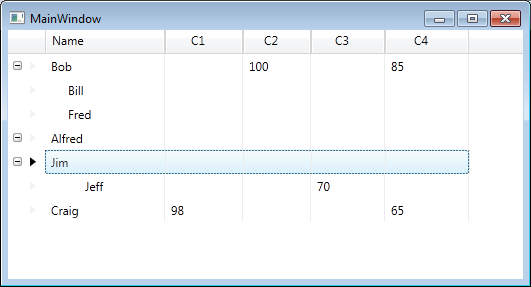
our view will now look like this

Dynamically added columns

Addendum

Whilst the above code works, at this point I would tend towards creating my own XamDataGrid derived class and implementing most/all the functionality in that class instead of the code behind. There may be alternate ways to achieve this, I’ve heard of people creating behaviors for the XamDataGrid to handle the creation of the dynamic columns.

Indenting column data in hierarchical data in the XamDataGrid

Before I start this post, let me just say I’m using an old version of the Infragistics XamDataGrid for this post, version 10.3. Hence this may have been changed in subsequent releases, but as I have a legacy application to support, that’s the version they’re using.

So in my previous blog posts on displaying hierarchical data within the XamDataGrid I demonstrated how to get the grid to look a little like a tree view, i.e. show the data in aligned columns etc. but I also mentioned that it wasn’t yet good enough as the child nodes are not indented.

So let’s look at how we might indent the child nodes so that they look more like a tree view and differentiate between child nodes and parent nodes.

What we want to do is change this

Before indentation

to this

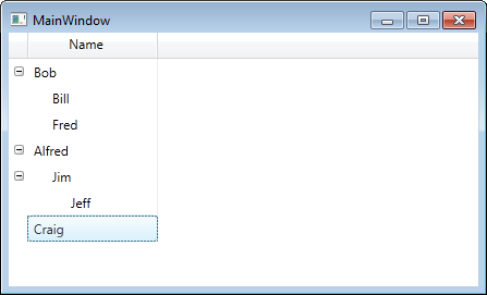
After indentation

Here’s a reminder of how our XAML looked at the end of the previous post

<igDP:XamDataGrid DataSource="{Binding}" GroupByAreaLocation="None" x:Name="grid"
   FieldPositionChanged="Grid_OnFieldPositionChanged">
   <igDP:XamDataGrid.Resources>
      <Style TargetType="{x:Type igDP:LabelPresenter}">
         <EventSetter Event="SizeChanged" Handler="EventSetter_OnHandler"/>
      </Style>
   </igDP:XamDataGrid.Resources>

   <igDP:XamDataGrid.FieldLayoutSettings>
      <igDP:FieldLayoutSettings ExpansionIndicatorDisplayMode="CheckOnDisplay"
         AutoGenerateFields="False"/>
   </igDP:XamDataGrid.FieldLayoutSettings>
   <igDP:XamDataGrid.FieldLayouts>

      <igDP:FieldLayout Key="parent">
         <igDP:FieldLayout.Fields>
            <igDP:Field Name="Name" />
            <igDP:Field Name="Manages" Visibility="Hidden" />
         </igDP:FieldLayout.Fields>
      </igDP:FieldLayout>

      <igDP:FieldLayout Key="child">
         <igDP:FieldLayout.Settings>
            <igDP:FieldLayoutSettings LabelLocation="Hidden" 
                 DataRecordPresenterStyle="{StaticResource childDataRecordStyle}"/>
         </igDP:FieldLayout.Settings>
         <igDP:FieldLayout.Fields>
            <igDP:Field Name="Name"/>
             <igDP:Field Name="Manages" Visibility="Hidden" />
         </igDP:FieldLayout.Fields>
      </igDP:FieldLayout>

   </igDP:XamDataGrid.FieldLayouts>
</igDP:XamDataGrid>

We’ve already used a value converter once, to align the columns, we’re going to use the same technique now to indent our cell data. Here’s the convert code

public class ChildCellValueConverter : IValueConverter
{
   public object Convert(object value, Type targetType, object parameter, CultureInfo culture)
   {
      return value == null ? Binding.DoNothing : new Thickness((((int)value / 2) * 17), 0, 0, 0);
   }

   public object ConvertBack(object value, Type targetType, object parameter, CultureInfo culture)
   {
      throw new NotImplementedException();
   }
}

Now let’s implement the resource code in XAML

<controls:ChildCellValueConverter x:Key="childCellValueConverter" />

<Style x:Key="childCellValueStyle" TargetType="{x:Type igDP:CellValuePresenter}">
   <Setter Property="Margin" Value="{Binding NestingDepth, Converter={StaticResource childCellValueConverter}}"/>
</Style>

and finally we need to update the field layout (for the “child”) to add the following (within the Field “Name” element

<igDP:Field.Settings>
   <igDP:FieldSettings CellValuePresenterStyle="{StaticResource childCellValueStyle}" />
</igDP:Field.Settings>

and there we have it. Now the child records indent.

Note: Unfortunately the solution to displaying the child nodes offset from the parent nodes is not perfect. You may notice white space where text should be for some rows. If I come up with a solution I’ll update this post accordingly.

Solving the display of alternate layouts for hierarchical view model in the XamDataGrid

Before I start this post, let me just say I’m using an old version of the Infragistics XamDataGrid for this post, version 10.3. Hence this may have been changed in subsequent releases, but as I have a legacy application to support, that’s the version they’re using.

From previous posts you’ll notice we had to create an altered view of our preferred view model, i.e. we should just have an EmployeeViewModel which has a property, named Manages, which is itself a collection of EmployeeViewModel objects, instead we ended up creating a ManagerViewModel and EmployeeViewModel (please refer to the previous posts for more info). So I want to use the following view model now (and fix this problem with field layouts)

public class EmployeeViewModel
{
   public EmployeeViewModel()
   {
      Manages = new ObservableCollection<EmployeeViewModel>();
   }

   public string Name { get; set; }
   public ObservableCollection<EmployeeViewModel> Manages { get; private set; }
}	

and just for completeness, here’s a factory to show our sample data

public static class EmployeeViewModelFactory
{
   public static ObservableCollection<EmployeeViewModel> Create()
   {
      var employees = new ObservableCollection<EmployeeViewModel>();

      var bob = new EmployeeViewModel { Name = "Bob" };
      var bill = new EmployeeViewModel { Name = "Bill" };
      var fred = new EmployeeViewModel { Name = "Fred" };
      var alfred = new EmployeeViewModel { Name = "Alfred" };
      var jim = new EmployeeViewModel { Name = "Jim" };
      var jeff = new EmployeeViewModel { Name = "Jeff" };
      var craig = new EmployeeViewModel { Name = "Craig" };

      bob.Manages.Add(bill);
      bob.Manages.Add(fred);

      alfred.Manages.Add(jim);

      jim.Manages.Add(jeff);

      employees.Add(bob);
      employees.Add(alfred);
      employees.Add(craig);

      return employees;
   }
}

So here’s the XAML we’d like to use

<igDP:XamDataGrid DataSource="{Binding}" GroupByAreaLocation="None" x:Name="grid"
      FieldPositionChanged="Grid_OnFieldPositionChanged">
   <igDP:XamDataGrid.Resources>
      <Style TargetType="{x:Type igDP:LabelPresenter}">
         <EventSetter Event="SizeChanged" Handler="EventSetter_OnHandler"/>
      </Style>
  </igDP:XamDataGrid.Resources>

  <igDP:XamDataGrid.FieldLayoutSettings>
     <igDP:FieldLayoutSettings ExpansionIndicatorDisplayMode="CheckOnDisplay"
           AutoGenerateFields="False"/>
     </igDP:XamDataGrid.FieldLayoutSettings>
     <igDP:XamDataGrid.FieldLayouts>
                
        <igDP:FieldLayout>
           <igDP:FieldLayout.Fields>
              <igDP:Field Name="Name" />
              <igDP:Field Name="Manages" Visibility="Hidden" />
           </igDP:FieldLayout.Fields>
        </igDP:FieldLayout>

        <igDP:FieldLayout>
           <igDP:FieldLayout.Settings>
              <igDP:FieldLayoutSettings LabelLocation="Hidden" />
           </igDP:FieldLayout.Settings>
           <igDP:FieldLayout.Fields>
              <igDP:Field Name="Name" />
              <igDP:Field Name="Manages" Visibility="Hidden" />
           </igDP:FieldLayout.Fields>
       </igDP:FieldLayout>
                
    </igDP:XamDataGrid.FieldLayouts>
</igDP:XamDataGrid>

and finally here’s the code behind

private void EventSetter_OnHandler(object sender, SizeChangedEventArgs e)
{
   var lp = sender as LabelPresenter;
   if (lp != null)
   {
      if (grid.FieldLayouts[0].Fields.Contains(lp.Field))
      {
         var f = grid.FieldLayouts[1].Fields[lp.Field.Index];
         f.Width = new FieldLength(lp.Field.CellWidthResolved);
      }

      if (grid.FieldLayouts[1].Fields.Contains(lp.Field))
      {
         var f = grid.FieldLayouts[0].Fields[lp.Field.Index];
         f.Width = new FieldLength(lp.Field.CellWidthResolved);
      }
   }
}

private void Grid_OnFieldPositionChanged(object sender, FieldPositionChangedEventArgs e)
{
   if (grid.FieldLayouts[0].Fields.Contains(e.Field))
   {
      foreach (var field in grid.FieldLayouts[0].Fields)
      {
         if (field.Index < grid.FieldLayouts[1].Fields.Count)
         {
            var field2 = grid.FieldLayouts[1].Fields[field.Index];
            field2.ActualPosition = new FieldPosition(field.ActualPosition.Column,
                        field.ActualPosition.Row,
                        field.ActualPosition.ColumnSpan,
                        field.ActualPosition.RowSpan);
         }
      }
   }
}

Note: I’m using the two methods I originally defined which expect two field layout objects only, feel free to substitute them for the more generic ones I showed in a previous post

Now the problem we had previously with this self-referencing view model is that XamDataGrid matches to the first field layout everytime, we’re going to programmatically change this. As you can see from the XAML, the second field layout hides the LabelLocation, so what we want is that when rendering the child nodes, we use the second field layout and obviously when rendering the parent, we want the first field layout. So let’s assign keys to both field layouts.

I’ve given the key “parent” to the first field layout and “child” to the second, i.e.

<igDP:FieldLayout Key="parent">
   <!--- removed for brevity -->
</igDP:FieldLayout>

<igDP:FieldLayout Key="child">
   <!--- removed for brevity -->
</igDP:FieldLayout> 

Now in the code behind (assuming the XamDataGrid has the x:Name “grid”) we can simply add one line to the constructor of the Window hosting the XamDataGrid

grid.AssigningFieldLayoutToItem += grid_AssigningFieldLayoutToItem;

and then create the following method

private void grid_AssigningFieldLayoutToItem(object sender, AssigningFieldLayoutToItemEventArgs e)
{
   if (e.Item != null)
   {
      e.FieldLayout = 
           e.ParentExpandableFieldRecord == null ? 
           grid.FieldLayouts["parent"] : 
           grid.FieldLayouts["child"];			
   }
}

So now you’ll notice that child nodes no longer display the header but the parent nodes still do.

If you’ve recreated this code you’ll notice we’re back to the problem we fixed in a previous post, regarding the child columns not in alignment with the parents.

We can fix this quite easily (although all the kudos for this goes to a colleague of mine who solved this a while ago). What we need to do is created a new DataRecordPresenterStyle for the child layout’s field layout settings, thus

<igDP:FieldLayoutSettings 
     LabelLocation="Hidden" 
     DataRecordPresenterStyle="{StaticResource childDataRecordStyle}"/>

and the corresponding childDataRecordStyle will be declared in the resources section as

<controls:ChildDataRecordConverter x:Key="childDataRecordConverter" />

<Style x:Key="childDataRecordStyle" TargetType="{x:Type igDP:DataRecordPresenter}">
   <Setter Property="RenderTransform">
      <Setter.Value>
         <TranslateTransform Y="0" 
               X="{Binding NestingDepth, Converter={StaticResource childDataRecordConverter}}" />
      </Setter.Value>
   </Setter>
</Style>

Finally we need the converter code

public class ChildDataRecordConverter : IValueConverter
{
   public object Convert(object value, Type targetType, object parameter, CultureInfo culture)
   {
      return value == null ? Binding.DoNothing : -(((int) value/2)*17);
   }

   public object ConvertBack(object value, Type targetType, object parameter, CultureInfo culture)
   {
      throw new NotImplementedException();
   }
}

The trick here is we’re going to transform the rendering of the data record using the nesting depth.

At this point we should now have a view model that looks more natural and columns all lining up, but we still have one problem to solve. The child records need to indent slightly to better show they’re child nodes of a parent node – currently it’s difficult to see (when expanded) whan are child and what are parent nodes. So we’ll look at solving this in the next post.

Synchronizing the columns in hierarchical in a XamDataGrid

Before I start this post, let me just say I’m using an old version of the Infragistics XamDataGrid for this post, version 10.3. Hence this may have been changed in subsequent releases, but as I have a legacy application to support, that’s the version they’re using.

If you followed my previous post on using hierarchical data in a XamDataGrid, you’ll have noticed that the final image was hardly impressive, in that columns were not all in sync and if you resize a column, not all columns resize.

For now, let’s remove the second FieldLayout’s hidden field, so our XAML looks like the following (I’ve commented out the offending line)

<igDP:XamDataGrid GroupByAreaLocation="None" DataSource="{Binding}" Name="Grid">
   <igDP:XamDataGrid.FieldLayoutSettings>
      <igDP:FieldLayoutSettings ExpansionIndicatorDisplayMode="CheckOnDisplay"
                                          AutoGenerateFields="False"/>
   </igDP:XamDataGrid.FieldLayoutSettings>
   <igDP:XamDataGrid.FieldLayouts>
      <igDP:FieldLayout>
         <igDP:FieldLayout.Fields>
            <igDP:Field Name="Name" />
            <igDP:Field Name="Manages" Visibility="Hidden" />
         </igDP:FieldLayout.Fields>
      </igDP:FieldLayout>

      <igDP:FieldLayout>
         <igDP:FieldLayout.Settings>
            <igDP:FieldLayoutSettings LabelLocation="Hidden" />
         </igDP:FieldLayout.Settings>
         <igDP:FieldLayout.Fields>
            <igDP:Field Name="Name" />
            <!-- remove this line for now
            <igDP:Field Name="DepartmentManages" Visibility="Hidden" />
            -->
         </igDP:FieldLayout.Fields>
      </igDP:FieldLayout>

   </igDP:XamDataGrid.FieldLayouts>
</igDP:XamDataGrid>

This will produce the following

Columns aligned in parent child relationship

However, this is an illusion that. All is still not quite as we want – if we resize the parent then you’ll see that child columns do not remain in sync with the parent. To handle this, let’s go back to the XAML and add the following to the XamDataGrid

Note: I gave the XamDataGrid the name “Grid” as we’re going to need to write some code for the following changes in functionality.

<igDP:XamDataGrid.Resources>
   <Style TargetType="{x:Type igDP:LabelPresenter}">
      <EventSetter Event="SizeChanged" Handler="EventSetter_OnHandler"/>
   </Style>
</igDP:XamDataGrid.Resources>

The EventSetter_OnHandler code looks like this

private void EventSetter_OnHandler(object sender, SizeChangedEventArgs e)
{
   var lp = sender as LabelPresenter;
   if (lp != null)
   {
      if (Grid.FieldLayouts[0].Fields.Contains(lp.Field))
      {
         var f = Grid.FieldLayouts[1].Fields[lp.Field.Index];
         f.Width = new FieldLength(lp.Field.CellWidthResolved);
      }

      if (Grid.FieldLayouts[1].Fields.Contains(lp.Field))
      {
         var f = Grid.FieldLayouts[0].Fields[lp.Field.Index];
         f.Width = new FieldLength(lp.Field.CellWidthResolved);
      }
   }
}

Now when you resize the columns all will remain in sync, however as you can see from the code this is all a little nasty in that it’s very much dependent upon the number of FieldLayouts you have etc.

Let’s not worry too much about that at the moment. As there’s something a little more pressing, if you happend to expose multiple columns, for example, suppose I added an age column to the parent and child view models and added the fields to the XAML. When moving a column around you’ll notice the child will not reorganise it’s columns, so you’d end up with, for example – the parent columns Age followed by Name whereas the child would be Name followed by Age.

To fix this add the following FieldPositionChanged event intot he XamDataGrid

<igDP:XamDataGrid GroupByAreaLocation="None" 
    DataSource="{Binding}" 
    Name="Grid" 
    FieldPositionChanged="Grid_OnFieldPositionChanged"> <!-- our new addition -->

In the source code we’d now need to add the following

private void Grid_OnFieldPositionChanged(object sender, FieldPositionChangedEventArgs e)
{
   if (Grid.FieldLayouts[0].Fields.Contains(e.Field))
   {
      foreach (var field in Grid.FieldLayouts[0].Fields)
      {
         if (field.Index < Grid.FieldLayouts[1].Fields.Count)
         {
            var field2 = Grid.FieldLayouts[1].Fields[field.Index];
            field2.ActualPosition = new FieldPosition(field.ActualPosition.Column, 
                        field.ActualPosition.Row, 
                        field.ActualPosition.ColumnSpan, 
                        field.ActualPosition.RowSpan);
         }
      }
   }

   if (Grid.FieldLayouts[1].Fields.Contains(e.Field))
   {
      foreach (var field in Grid.FieldLayouts[1].Fields)
      {
         var field2 = Grid.FieldLayouts[0].Fields[field.Index];
         field2.ActualPosition = new FieldPosition(field.ActualPosition.Column, 
                     field.ActualPosition.Row, 
                     field.ActualPosition.ColumnSpan, 
                     field.ActualPosition.RowSpan);
      }
   }
}

Notice again we need to have knowledge about the number of field layouts to handle this correctly, but this will now work. Reordering the columns occurs across all rows.

This is not perfect – and obviously we need to look at rewriting our code to handle any number of FieldLayouts, but it’s a start. I’ve more things I need to do with this hierarchical data, so if it’s interesting enough I’ll continue with further posts, but for now, between this and the previous post on the subject, we can now display hierarchical data and keep the columns in sync.

Addendum

After writing this post I found a mad desire to rewrite the code to handle multiple FieldLayouts, this has not been tested fully (so use at your own risk) but here goes

private void EventSetter_OnHandler(object sender, SizeChangedEventArgs e)
{
   var lp = sender as LabelPresenter;
   if (lp != null)
   {
      var found = Grid.FieldLayouts.FirstOrDefault(fl => fl.Fields.Contains(lp.Field));
      if (found != null)
      {
         foreach (var fl in Grid.FieldLayouts)
         {
            if (!fl.Equals(found))
            {
               var f = fl.Fields[lp.Field.Index];
               f.Width = new FieldLength(lp.Field.CellWidthResolved);							
            }
         }
     }
   }
}

private void Grid_OnFieldPositionChanged(object sender, FieldPositionChangedEventArgs e)
{
   var found = Grid.FieldLayouts.FirstOrDefault(fl => fl.Fields.Contains(e.Field));
   if (found != null)
   {
      foreach (var field in found.Fields)
      {
         foreach (var fl in Grid.FieldLayouts)
         {
            if (!fl.Equals(found))
            {
               if (field.Index < fl.Fields.Count)
               {
                  var f = fl.Fields[field.Index];
                  f.ActualPosition = new FieldPosition(
                       field.ActualPosition.Column, 
                       field.ActualPosition.Row, 
                       field.ActualPosition.ColumnSpan, 
                       field.ActualPosition.RowSpan);
               }
            }
         }
      }
   }
}

Update

Revisiting this code to use it on a project I’m working on, I found I’d missed a piece off. When resizing the columns from the parent/header this works fine but XamDataGrid allows you to resize the child rows and we don’t have code to resize the parents and keep in sync.

An easy way to “fix” this is to disable resizing on columns except for on the header which we can achieve easily by adding to our grid XAML

PreviewMouseMove="Grid_OnPreviewMouseMove"

and in our code behind we have

// you'll need this using Infragistics.Windows;
private void Grid_OnPreviewMouseMove(object sender, MouseEventArgs e)
{
   var lp = Utilities.GetAncestorFromType(e.OriginalSource as DependencyObject, 
                typeof(LabelPresenter), true) as LabelPresenter;

   if (lp == null)
   {
      var cvp = Utilities.GetAncestorFromType(e.OriginalSource as DependencyObject, 
                    typeof(CellValuePresenter), true) as CellValuePresenter;
      if (cvp != null)
      {
         cvp.Field.Settings.AllowResize = false;
      }
   }
   else
   {
      lp.Field.Settings.AllowResize = true;
   }
}